Online newsletters have become an excellent way of keeping a community updated and engaged with the happenings of a company. After success with creating newsletters for personal within the healthcare industry, a patient centered newsletter was created in hope of keeping patients updated and involved in their own health as well as their community.
Healthy You Newsletter
Reaching You On The Go

Format was changed to reflect the updated email service provider’s capabilities for responsive design and bring a focus to one main story per email. An “ad” spot was added for MyChart, a online health record portal, which has always been one of the top clicked items in this newsletter and is a helpful reminder for patients to easily access their medical records.
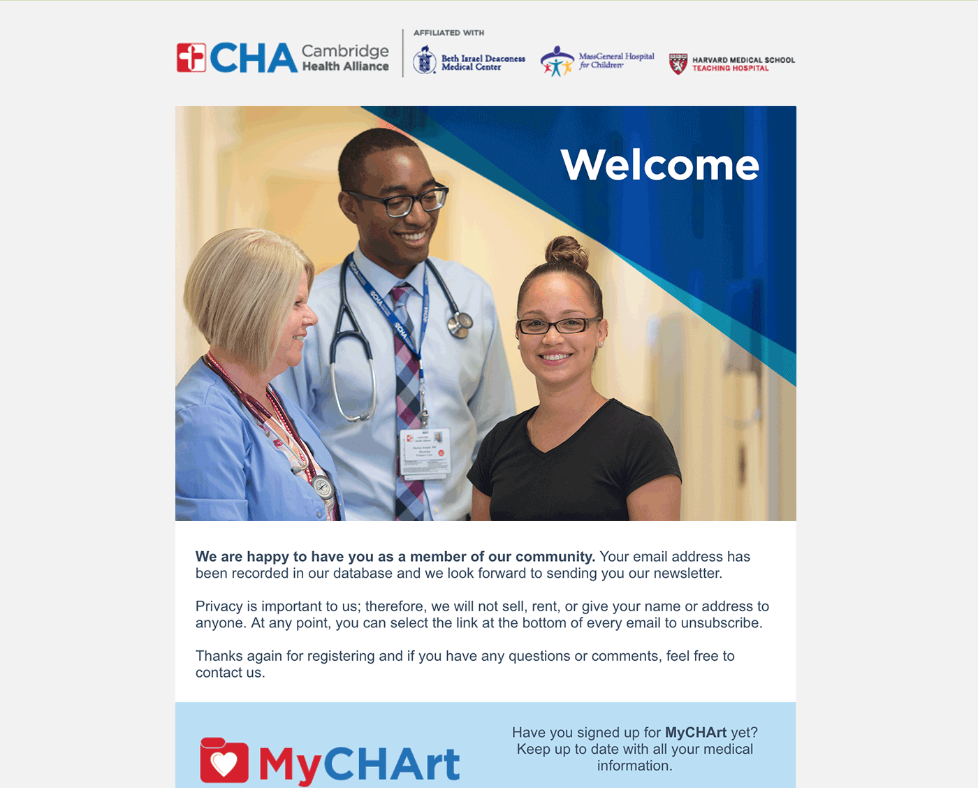
With such a high non-English speaking community, the welcome email was updated to show a connection to the community and cultural-competency by creating an image saying welcome in the top five languages used by patients at Cambridge Health Alliance as well as to remind new patients to sign up for MyChart for easy communication with their care team.
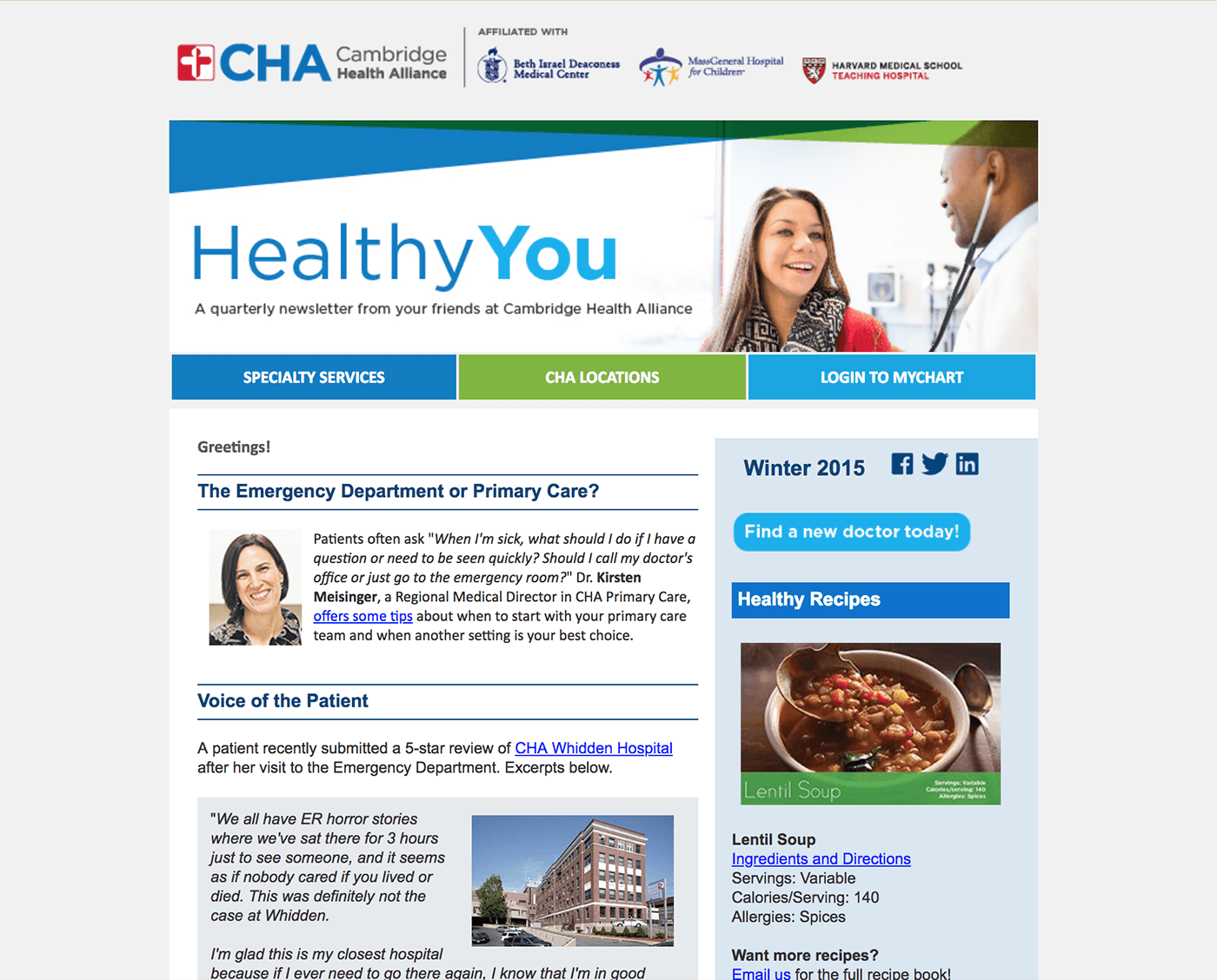
Based off of templates being used for healthcare professionals. Colored buttons were created to mimic a navigation bar with links to the useful pages for patients.

After seeing 62% of views were on mobile, the email layout was changed to a single column format for ease of viewing and utilizing the CHA Healthy Now blog for more information on topics.